Is it safe to come out now … and May 2020 End of Month Update

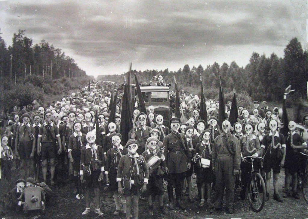
Viktor Bulla’s photograph of the “Pioneers of Leningrad” in a defense drill, 1937, showing the well equipped youth ready for anything … taken 4 years before the horrific Siege of Leningrad– From rarehistoricalphotos.com

This striking image of Leningrad children in their gasmasks has left a haunting impression on Slack Investor. The 900-day siege of the Russian city during WW2 claimed the lives of 800000 civilians – Many of the photographed children would have been involved.

Not trying to draw any parallels, but it is true to say that we are all a bit apprehensive about how to deal with this new post-lockdown world in Australia.

The number of fatalities for COVID-19 is still shocking and it is causing great hardship in many lives. In perspective though, the “big Daddy” virus is the 1918 Influenza where nearly a 1/3 of the world’s population was infected and global deaths amounted to almost 50 million people.

Given sufficient leadership (are you listening Donald and Boris!) the world will eventually see this COVID-19 off – like it has with all previous past viral outbreaks.

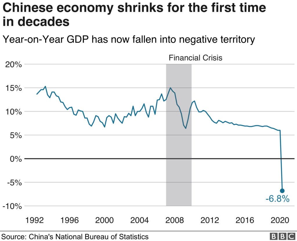
Slack Investor does have a furrowed brow about the whole world economy thing. Even bevore COVID-19, China’s economy was shrinking – and has now tanked.
From bbc.com

Although China is expected to recover later this year, things don’t seem so good for the moment. The International Monetary Fund (IMF) are describing it as the worst economic downturn since the Great Depression. It is tough to provide forecasts for this event and, as a retired meteorologist, I feel for my economy forecasting brothers and sisters. They predict both advanced and developing economies are expected to show signs of life in 2021.
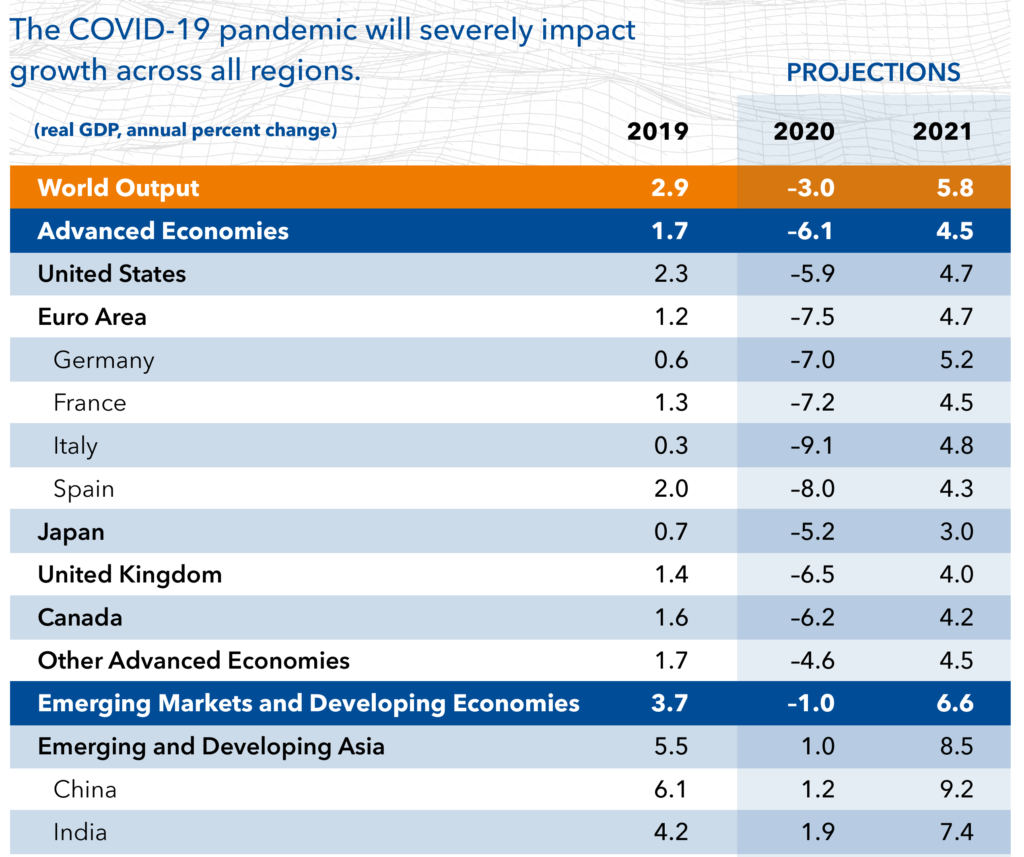
World economic growth projections by the International Monetary Fund (IMF) World Economic Outlook April 2020

No country is spared in this global crisis, in particular, nations with weak health systems, and more limited funds to provide support will struggle.

Slack Investor will leave the big world predictions to others and continue tinkering in a small way with his portfolio. What is obvious is that companies reliant on tourism, travel, hospitality, and entertainment for their growth are in big trouble. Emerging market and developing economies face additional challenges as they will find it harder to find investors to fund their projects in this climate.

This is not advice, but I will sell off my shares in emerging market ETF VGE and the Malaysian property trust UOS and buy some ETF’s such as NDQ or QLTY. I have had second thoughts about selling down my overweight position on CSL . This company continues to grow – and I just love owning it. – I would have topped up my holding this week as it is currently slipping in price to below $280 – but it is already a big chunk of my Portfolio.

May 2020 – End of Month Update

This image has an empty alt attribute; its file name is trend-1445464__180.jpg

Governments around the world have been mostly doing their job responsibly and adding stimulus to the world economies in these troubled times. In response to this, the Federal Reserve bank of Cleveland have stabilized the probability of a US recession within the next year at 19.4% (below Slack Investors threshold of 20% – so stop losses on index stocks are in hibernation). There has been some real optimism in the markets with further big monthly rises in all followed markets ASX200 +4.2%, FTSE100 +5.4% and S&P500 +7.6%.

The rise in the ASX200 has Slack Investor back into the market with a weekly change in momentum of the weekly charts signaling a BUY. It’s all a little bit crazy … but I am back to all IN! The 11-Period Directional Movement Index (ADX) change of greater than 0.6 is used as the momentum indicator for entry with the complexities of this process explained on the Resources page.
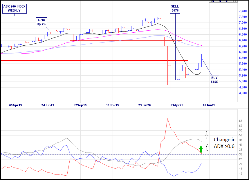
Weekly chart of the ASX200 Index showing the weekly price ranges and the three lines of the directional movement system for momentum trades below – incrediblecharts.com

All Index pages and charts  have been updated to reflect the monthly changes – ASX IndexUK IndexUS Index.

April 2020 – End of Month Update … The Real Cost of Early Super withdrawl

In relaxed lock down through the courtesy of COVID-19. But the stockmarkets never sleep.

The Federal Reserve bank of Cleveland have the probability of a US recession within the next year at 20.0% but there has been some optimism in the markets that there might be an eventual end to this wicked virus crisis. Rises in all followed markets ASX200 +8.8%, FTSE100 +4.0% and S&P500 +12.7%.

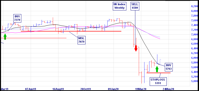
The rises in the UK and US have got Slack Investor back into the market with a change in momentum on the weekly charts signaling a re-entry. But it is with much trepidation – the rapid recovery seems to have been priced in a bit early!

Slack Investor has outlined in many posts about how to get out of trades with stop losses. But has been a bit lacking in detail on when to get back IN. When trend trading, my main tool for finding a buy signal is a trend following (or momentum) system called the Directional Movement Index. There are many ways of setting up this system. Slack Investor likes the “smoothing” that is enabled by a system that looks back over the previous 11 periods – but the complexities are best left for the Resources page.

UK Index weekly chart showing the weekly price ranges at the top and Average Directional Movement Index (ADX) patterns below – From Incredible Charts

I am quite comfortable with the re-entry into the UK Index shown above, but the rapid swings for the US charts have the Slack method back IN, but so far, performing worse than the “buy and hold” method. I will continue this index market timing experiment for another 4 years (to make it a 20-year trial).

All Index pages and charts  have been updated to reflect the monthly changes – (ASX IndexUK IndexUS Index).

Super Withdrawal … should you?

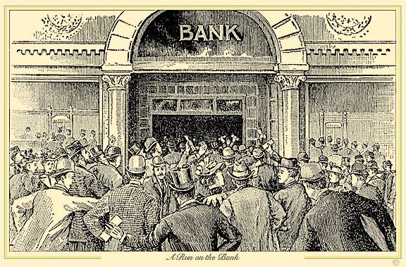
“A Run On the bank” an etching from the 1930’s – from sutori.com

The Australian Government has gone into real governing mode and set up some measures to help people get through this COVID -19 crisis. They have established “JobKeeper” payments ($1500 per fortnight), doubled “JobSeeker” payments (up to $1100 per fortnight), and allowed the unemployed and people whose hours have been cut by 20 per cent to access up to $20000 of their super early. There are some rules.

Slack Investor understands that times are tough for the many who have lost their jobs, but is disturbed that 881,600 people had registered with the government for early superannuation access – and this could blow out to 1.5 million people. Unfortunately (particularly if you have credit card debt), this will be a necessary step for some. Slack investor implores those affected to exhaust all other options first – an early superannuation withdrawal does have repercussions further down the track.

Comparing potential withdrawal impacts at different ages

Investor’s current ageYears to retirementValue of $10,000 at retirementValue of $20,000 at retirement
670$10,000$20,000
5710$17,908$35,817
4720$32,071$64,143
3730$57,435$114,870
2740$102,857$205,714
Source: Vanguard calculations – These calculations show a significant projected eventual cost of super withdrawal. However, these raw figures do not allow for inflation. A projection allowing for inflation (2%) using the smartasset inflation calculator shows that the $10 000 withdrawal after 40 years will grow to a still significant $46578 in 2020 dollars ($102857 in 2060 dollars).

Slack Investor knows that accessing cash like this has consequences and that people should make an informed choice between their short term financial need and their long term financial position. 

There is also the effect on your insurance with the withdrawal of super … if you go to a zero balance, your super-related death and disability insurance will cease. Even if you return to work, it will not automatically reinstated until your account balance reaches $6000.

A real-life example from the Slack Investor chronicles. A long long time ago in 1982, a 25-year old Slack Investor wanted to travel overseas for the first time. Funds were a bit short and he had saved some money … but not enough for a whole year travelling. I had a superannuation balance of $3500 (This would be worth almost $10000 in 2020 dollars using the smartasset inflation calculator).

Back in those days, prior to compulsory super, you were allowed to cash your super in – and I stupidly did. To save up this kind on money would have taken another 3 months of saving and working – I chose the instant gratification.

Slack Investor is a great believer in the “tried and true” problem solving method of

  1. Research – Weigh up the pros and cons …
  2. Make a decision
  3. Move On … No Regrets – you have made the decision with the available facts.

However, the pulling out of my super when I was in my twenties is one of the few things that brings me just a tinge of regret.

The Hesta Retirement Balance Projection Calculator shows that my $3500 would have grown to nearly $31000 at my 62-year old retirement date (Assumptions: at 8% growth and 2% inflation). Slack Investor likes this calculator as it allows you to set assumptions that help account for inflation as well as growth.

Perhaps if I had just delayed my trip by a few months and worked a bit longer, I might have been able to retire just a little bit earlier. Ah well … we make our decisions and … such is life.

Be safe, be kind … and make an informed decision about releasing your super early.

The Wedgie is Working – January 2019 Wedgie stocks 1-yr review

Australian lifeguards are known to roll their Speedos up during surfboat races to give better contact between the buttocks and the wooden seat of the boat while rowing. The image is gratuitously included because “Wedgies” are just …just … funny! -Downloaded from http://westalai.blogspot.com/ – may be subject to copyright

Slack Investor introduced one of his favourite technical chart patterns in January 2019 … “The Wedgie”. I promised to look at the results in 12 months time.

Looking at charts of stock prices and trying to recognise useful patterns is known as Technical Analysis. Some investors do not have faith in in this dark science … and Slack Investor would not act on chart signal alone – the underlying company must be sound with established earnings and good prospects.

“The Wedgie” is Slack Investor’s name for a pattern more boringly known as the “breaking of a long-term downtrendline“. You have to admit … “the Wedgie” has a more of a ring to it.

The breakout from a Wedgie on a share price chart is discussed in detail in the original post and it is when the share price rises out of the wedge pattern. The top of the wedge downtrend line should be drawn for a period of at least 3 months and connect at least 2 (and preferably 3) descending high points.

This pattern has the potential to be a trend “reversal” – Lets see how it has performed over 12 months for the Slack Investor bought stocks. The first 3 are all still in the portfolio.

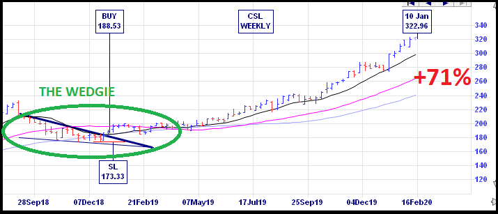
CSL – Commonwealth Serum Laboratory

This great company share price was consolidating a year ago but has recently boomed with a 71% gain.

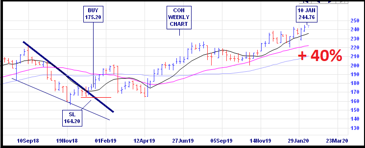
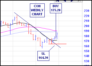
COH – Cochlear

Weekly Chart for COH – from incrediblecharts.com40% gain.

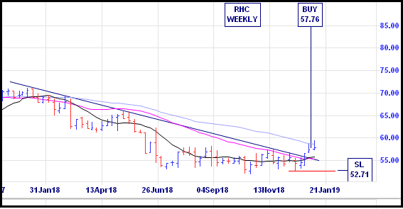
RHC – Ramsay Health Care

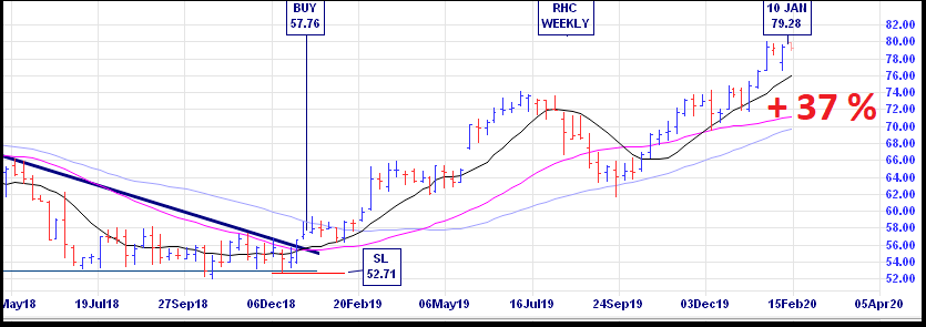
Weekly Chart for RHC – from incrediblecharts.com 37% gain.

In the January 2019 post, ALU, APX, CAR, CCP, FPH, SEK, and A2M were also mentioned as breaking the wedgie pattern. All of them have made very good gains since the breakout from “the wedgie”. Gains of 73%, 64%, 48%, 76%, 74%, 29% and 25%, respectively – from January 18, 2019 to February 10, 2020. Slack Investor thinks that, so far, the Wedgie is working in most cases! – but, it has no guarantee – vigilance is required.

The Wedgie does not always work, CGC – Costa Group –

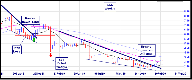
Weekly Chart for CGC showing two distinct wedge patterns. The first one showed promise then the price quickly turned south after some earnings downgrade announcements. The second wedgie looks worthy of investigation – from incrediblecharts.com

CGC was not mentioned in the original post and clearly the first break of the downtrend in November 2018 lost a bit of steam due to drought and supply problems – Slack Investor was, sadly, an investor in this stock at the time – and it was a loser! This is an example of the wedgie pattern NOT working. However, for all of 2019, CGC has been in a long-term downtrend but the pattern is starting to get interesting again as the longer the downtrend line the more bullish it will be when the stock breaks above the trendline.

As always, however great the pattern may look, Slack Investor is interested in the fundamentals of this stock before he will invest. Wisetech (WTC) is also breaking its Wedgie. Using marketscreener.com, CGC has a good 2021 forecast PE and yield, but the 2021 ROE is too low (<15%). WTC has good Return on Equity (ROE) but the 2021 forecast PE is too high for me (Slack Investor likes the forecast PE to be less than 40-50) … So, despite good looking technical patterns, it is no investment from Slack Investor for these two.

SI Wedgie 2020 P/E 2021Yield % 2021ROE % 2021
Costa GroupCGC173.39
WisetechWTC820.221

Let’s visit CGC and WTC in 12 months for the sake of curiosity. Long live the Wedgie!

March 2019 – End of Month Update … and Revised Slack Index Method

Slack Investor remains IN for Australian index shares and IN for the US Index S&P 500. The dogs’s breakfast of Brexit still weighs heavily in my mind but I am buying back IN for UK Index shares – as the FTSE 100  has shown remarkable resilience to the fraught politics of Brexit and displayed a monthly uptrend. I will buy back IN to the FTSE at near the end of March value of 7279 (See UK Index Page).

There were rises in all  Slack Investor followed markets (ASX200 +0.2%; FTSE100 +2.9%;  S&P500 +1.8%).  All Index pages and charts  have been updated to reflect the monthly changes – (ASX Index, UK Index, US Index).

The Slack Monthly Index Trading Method – Revised

Last month I mused about the diminishing returns of the Slack Monthly Index Trading Method. I am still outperforming the “Buy and Hold” investor in all followed markets – but the advantage is slim. Per annum outperformance is 2.9%, 1.2% and 1.1% for the ASX, UK and US markets respectively. Not really fantastic results when you consider that I am missing out on the “buy and hold” dividends for the times when I am out of the markets.

The Slack Index method was devised with a lot of back-testing on 30 years of market performances and does really well when sustained bear markets occur as it gets out of the market at a hopefully early stage in the price downturn. Ideally, the Slack method should stay in the market for the smaller fluctuations (corrections <~10%) and get out of stocks before it becomes a full bear market. The problem with my current strategy is that I am getting “whipsawed” out of the market in these smaller downturns.

Connection between US Bear markets and Recessions

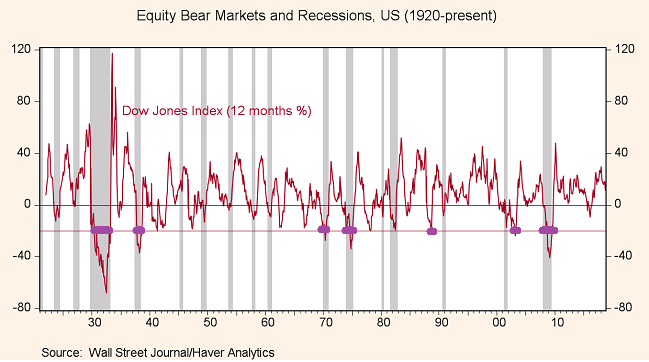
There is a link (not a perfect link!) between US bear markets (drops of more than 20%) and US recessions. In the chart below, the bear markets are shown in thick purple lines and they mostly coincide with US recessions (grey columns).

Modified chart 1920-2019 showing (in purple) the bear markets (where the red US stock prices fall >20%) and the US recessions shown as grey columns – From Gavyn Davies Financial Times – Original source Haver Analytics

All well and good so far, but we want to be out of the markets before a recession … how can we predict recession? Should we ask economists? A recent survey found that 3/4 of those surveyed thought there would be a recession before 2021. This is good to have in the mind … but not that useful in a practical sense. Economists have a poor record in predicting recessions. I don’t mean to be mean to economists … I also have had a career in prediction (weather!) and there are many similarities. Like the atmosphere, economics is complicated, not all factors are known, and not all processes are truly understood – But we do our best!

The “Inverted Yield Curve” as a predictor of US Recession

There might be an answer to predicting recessions by using the US Treasury Bond “Yield curve” . You may have heard about the yield curve (Probably not! but read here) – where short-term US treasury bill yields are compared to long-term yields. Normally, you would expect the yields on your money to be higher the longer that you lock it away – this corresponds to the periods above the red line on the graph below. Usually, the 10-year Treasury bill yield is greater than the 1-year bill yield. However, if there is a very a gloomy US outlook and the Feds are raising rates, you can earn more in the short term. This is when the yield difference [10-yr minus 1-yr (or 2-yr)] slips into negative territory, and you have an inverted yield curve – shown with the thick purple lines below. Note that these inverted yields usually occur one to two years before a recession (grey columns).


Chart showing where the yeild curve becomes inverted (purple lines) with the US recessions shown as grey columns. Modified from Morningstar report – original source Gurufocus.com

I love being the owner of companies and much prefer being in the share market than not. I will adopt the brand new exciting Slack Monthly method that should keep me in shares for the smaller downturns (corrections). I will ignore any monthly downturn signals UNLESS there is a sustained period of the US Inverted Yield Curve. I can check this at the end of the month at Gurufocus.com. This should maximise my chances of staying in shares until there is a threat of recession and the expectation of a larger downturn.

Jacinda Ardern shares a hug at a Wellington Mosque – From The Guardian

This has been a tough month for this part of the world – where, in Christchurch, a hate-filled idiot with a gun can a cause so much heartache for decent families. Great respect to the people of New Zealand and their exceptional leader Jacinda Ardern for bringing gun reform and such a strong message for humanity in the wake of this tragedy.

Power to love, tolerance and humanity.

Innovation Boom

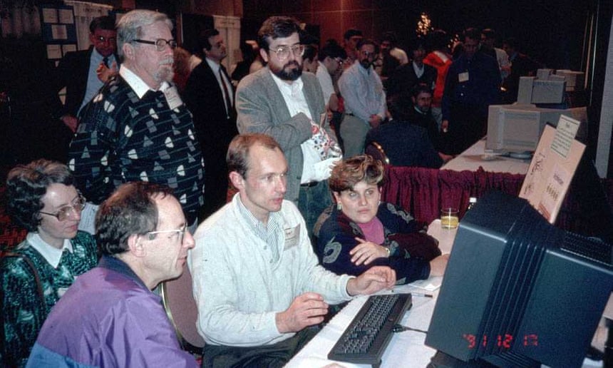
Tim Berners-Lee (in the white shirt) demonstrating the world wide web to nerdy enthusiasts at a 1991 conference in Texas.  – From theguardian.com

I have been lucky enough to live through one revolutionary innovative idea that has changed the world. The magnificent Internet – a global system of connected computer networks which has been developing since 1983 – but it was Tim Berners-Lee who introduced the publicly available World Wide Web in 1991 – This was a way of connecting the vast resources and documents on the internet through hypertext and URL’s.

It was 26 years ago, in 1993, when things really started to take-off with the first graphical web browser. Imagine how different the world was without the internet innovations such as Search Engines, Web Browsers, Real time streaming, emails, e-banking, online shopping, wi-fi and, my favourite, GPS linked to an internet map.

My portfolio is filled with companies that have made growing businesses based upon this innovative technology. Altium (ALU), Appen (APX), RealEstate.com (REA), Rhipe (RPH), and Seek (SEK) are all companies that make extensive use of the Internet.

The science man in me (Nerdy part) doesn’t really trust a graph without a vertical scale but I came across this image below from an Ark Investment report that really made me think. It puts other great innovations into some historical context and points to a series of new innovations that are predicted to have a large effect on economic activity in the future – One thing I don’t agree with on the image is the author’s notion of tapering off the impact of internet as we go towards 2020. But I can see that at least some of the innovations mentioned on the right will have a big impact on our future.


Impact of innovations on the economy – ARK Investment Management LLC, 2018 from Ark Invest

Part of being Slack is not wanting to research all of these head-hurting new ideas myself (but they do sound interesting!) and I think I should outsource this to someone else. Luckily there are a few research boffins at BetaShares that have come up with the BetaShares Global Robotics and Artificial Intelligence ETF – (RBTZ).

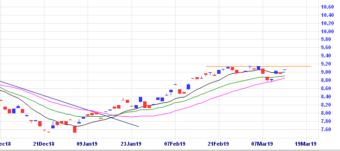
The ETF covers two of the emerging innovative sectors, Robotics and AI. This fund invests in an index of companies involved in Industrial Robotics and Automation, Non-Industrial Robots, Artificial Intelligence and Autonomous Vehicles and Drones. There is a cost – a management expense ratio of 0.57% ($57 per $10000 invested p.a.). Costs of investment are really important for the total returns on your investments. In this case, this is a cost that I am willing to pay and am looking for an opportunity to invest in the RBTZ ETF soon as I have finally unloaded my Challenger (CGF) shares and have a bit of cash to invest. I will wait till this chart shows some upward price momentum and breaks through the orange line “double top resistance” on the CGF daily chart at $9.15.

Daily RBTZ chart BetaShares Global Robotics and Artificial Intelligence ETF – from incrediblecharts.com

Oh … and in passing, thanks to Sir Timothy John Berners-Lee for that world wide web thing … it was a pretty good idea!

February 2019 – End of Month Update … and Challenger rethink … and Trump

Slack Investor remains IN for Australian index shares and OUT for UK Index shares. The US Index S&P500 has now shown enough sustained positive momentum on the monthly chart that I am buying back IN on the S&P500 today (1 Mar 2019).

Recovery continues with rises in all  Slack Investor followed markets (ASX200 +5.2%; FTSE100 +1.5%;  S&P500 +3.0%). 

A Reprieve for Challenger

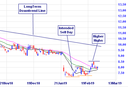
Last post I was looking to get out of Challenger … a stock that I have fallen out of love with … due to months of disappointing declining share price. On the day of intended disposal, I noticed that it had gone up 2%. Slack Investor doesn’t like to swim against the tide … and I delayed … it went up again the next day on increased volume – the sign that someone is buying the stock in some numbers. The daily chart started to look like an uptrend was being established. Higher Highs and Higher lows … so, I am still an owner of the stock until this uptrend pattern breaks. This takes a bit more vigilance than Slack Investor really likes as it takes a daily look at the chart pattern … The reasoning is that it is annoying when a stock bounces back immediately after I sell (this has happened a few times!) and I will ride this (could be temporary) upswing as long as it lasts.

Challenger (CGF) Daily chart -From Incrediblecharts.com

Trump

Image from tenor.com

The Donald is never far away in the news. Never boring … frequently appalling. A question in #Quora asked “Why do some British people not like Donald Trump?” An English writer, Nate White, penned this magnificent response in full here – but you can get the jist from the opening paragraph .

Trump lacks certain qualities which the British traditionally esteem.
For instance, he has no class, no charm, no coolness, no credibility, no compassion, no wit, no warmth, no wisdom, no subtlety, no sensitivity, no self-awareness, no humility, no honour and no grace – all qualities, funnily enough, with which his predecessor Mr. Obama was generously blessed.

From an article by Nate White

Further education on the quality of Donald Trump’s character can be found on the Donald Trump sexism tracker. It is a great article that is almost impossible to finish without feeling a little ill – and an uneasy feeling about how we got to this point.

All Index pages and charts  have been updated to reflect the monthly changes – (ASX Index, UK Index, US Index).

Workin’ the Wedgie – Breaking Downtrends

The “Wedgie” is a classic Australian image that brings delight to the Slack Investor. Last post, I referred to a breakout from a “falling wedge” in the ASX 200 weekly chart. There are all sorts of patterns that technical (using charts) investors use. Slack Investor concedes that, as the pattern was longer than 3 months – he should have referred to the pattern as “breaking a long-term downtrendline“. However, this term is not as engaging to the eye, or as dead set funny, as the “Wedgie”.

The breakout from a long-term downtrend on a share price chart is one of the classics and the technical signal has more validity on a weekly chart than a daily one. Slack Investor loves this pattern and has been patient over the last few months as stocks have been sinking worldwide. He has trimmed his portfolio and has some cash and feels now is the right time to test the waters. This breakout from a long downtrend has the potential to be a trend “reversal”.

There comes a time when stock prices fall to a price that buyers start coming back into the market and the share price comes back up. If it is sustained, this is called a “reversal”. In “Technical Speak”, a new trend is only established when a new “higher low” is established – so, this is an early call – supported by the establishment of a stop loss on all buy orders.

Trading the long term downtrend breakout

Admittedly, these trades just make the definition of a long term downtrend – but it has been a steep fall!

To be considered a long term trendline, the trendline should be at least 3 months. The longer the trendline the more bullish it will be when the stock breaks above the trendline.

From Dstockmarket.com
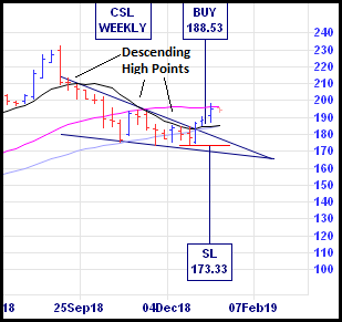
CSL Weekly chart – from incrediblecharts.com

The wedge pattern can be seen on the CSL chart. The critical part of this shape is the upper line of the wedge on your chart software. I highly recommend the free (if using day-old data) Incredible Charts to do this type of stuff. This upper line connects at least 2(and preferably 3) descending high points (that establish the downtrend) on your weekly chart. To get into this trade early, buy whenever the closing price breaks above the top downtrend line. Technically, a new uptrend has not been established yet. Confirmation of a new trend comes when a new “higher high” and “higher low” has been established. A more conservative entry point is when the new trend becomes obvious. An established trend trading rule is

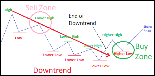
Buy the Higher Low and Sell the Lower High

A full explanation of this confusing set of words can be found in the Tyler Yell article at dailyfx.com or, shown schematically below

Image demonstrating the trend trading zones for the “Buy the Higher Low and Sell the Lower High” strategy. It boils down to selling when a downtrend is established (Lower High) and buying when a new uptrend is established (Higher Low). More trend stuff in a previous post The Trend is Your Friend.
Cochlear weekly chart – from incrediblecharts.com

But, enough of the theory.
Normally, I would wait until the new uptrend is a bit more entrenched, but the companies below have been on Slack Investors watch list for some time and they have a track record of increasing dividends. They have high P/E ratios as they are growth companies (and their projected growth is factored into their price). But what really impresses me is the way they use their capital. From Marketscreener.com, COH has a forecast 2020 Return on Equity (ROE) of 44%; RHC 23% and CSL 38%. If I put money into a bank deposit, I might get a paltry 3%. These companies are very good at getting returns on their investment (equity) – and I want to be involved!

Ramsay Health Care Weekly chart – from incrediblecharts.com

There are other Australian stocks on my Growth Stocks watchlist that show this downtrend breakout pattern. They include ALU, APX, CAR, CCP, FPH, SEK, and A2M. Unfortunately, my investment funds are not limitless. Not all of them will be winners, this is not advice, but I’d rather invest in companies like them – than get a “wedgie”.

I will report back on all of these “buy signals” in a year.

After a relationship breakup – When is the right time to start dating again?

Coco Chanel
Coco Chanel in 1920 ( ) – From bestlifeonline.com

Lets just get this out there … Slack Investor knows just the bare minimum on human relationships and isn’t qualified to give advice on matters of the heart. The only piece of useful knowledge that I can pass on is from, designer and business woman, Coco Chanel.

“As long as you know most men are like children, you know everything.”Coco Chanel (1883-1971) from source

It has been a torrid last couple of months in the share market and Slack Investor has had to say goodbye to some of his old friends (Stocks that I have had a relationship with!) Last post I briefly looked at when its time to break up with individual stocks – this is something Slack Investor always finds a hard thing to do as I have to overcome the “confirmation bias”  that tells me that I did the right thing in picking them in the first place – and, taking a loss sometimes is never pleasant. However, I steel myself with the conviction that it is the overall result that counts and to do that, you must associate with some winners

Let’s have a look at the overall Australian market. The economy is running along fine and the All Ordinaries is close to its long-term average value PE Ratio of 15 (15.6 Australian Financial Review 16/11/18). The US  pundits are starting to talk about a possible recession in couple of years time – but this is now – and Slack Investor still whiffs (but does not know!) that the current downturn is an ordinary correction in the charts due to a change in sentiment. In the UK, things look a bit of a Brexit mess – so expect more bad news there.

I start with a watchlist of 15-20 companies that I like – or have been recommended in the press or internet. I then go to the most excellent site marketscreener.com where you can access a variety of analyst data on world stocks by free registration – entering your stock symbol and then going to the financials tab. The thing I love about this site is the predictive data for the next couple of years. These figures are just forecasts as they are based upon the companies sales predictions for itself … but a good company won’t try to “gild the lily” too much on its predictions of earnings.

For each company, I write down their future PE’s, yield and Return on Equity (ROE). ROE is really important and should be 15 or more. A company must have increasing sales, an increasing history of dividends and manageable debt. I setup a group of companies that have reasonable numbers and put them in a table  (… like below!)

Company Symbol Future PE Future Yield % Future ROE Sales Inc Divdnd Inc Debt Chart Momtm
2019/2020 2019/2020 2019/2020 EPS History Chge(Wk)
Costa Group CGC 23/20 2.4/2.7 18/19 YES YES OK YES
Macquarie Group MQG 14/14 4.7/4.9 17/17 YES YES OK YES
Service Stream SSM 13/11 5.1/5.7 23/24 YES YES OK YES
Amcor AMC 15/12 5.0/5.3 67/71 YES YES OK YES
Reece REH 20/19 2.2/2.3 15/14 YES YES OK YES

That is the” fundamental” part of my analysis … and then I wait patiently, watching the weekly charts until there is a change in momentum on a stock – this is the “technical” part of the analysis. I will try to buy the company as soon as I can after this momentum change … but set a stop loss just In case I am wrong!

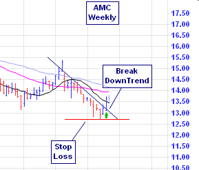
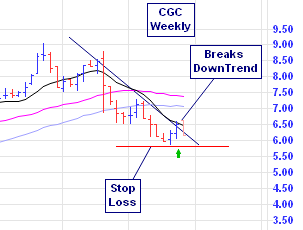
There are many chart indicators that show a change in momentum. I like using the 11-week Directional Movement Index (ADX) on a weekly chart – or a breakthrough of a downward trend line. Examples of changes in momentum are shown below on the weekly charts of Amcor (AMC) and Costa Group (CGC)

AMC Weekly chart – Incredible charts

CGC Weekly chart – Incredible charts

This is not advice … But I have recently bought these companies and will report back in a year as to how things have worked out.

I have also admired the US Technology Index (NASDAQ) from afar for a long time – but never had a chance to buy it. It is available  in Australia as a Beta Shares ETF (NDQ). However, NDQ is still moving south and has yet to break out of its downward trend.

Technically speaking, maybe it nearly is time to start dating again!