A few times a year, Slack Investor likes to take a snapshot of the markets using the Cyclically Adjusted Price to Earnings ratios (CAPE) which use ten-year average inflation-adjusted earnings. I first started using CAPE as a “value” tool in September 2021 and, my most recent look was in mid-November 2023. I have decided to do this CAPE market value analysis every 3 months – as I like to keep a feel of where we are – as the market cycles. The next update will be in mid-May 2024.
By plotting this CAPE over a period of time, we can look at how the whole sharemarket is currently valued in terms of historical data – this way we can track the whole share market as it oscillates between overvalued and undervalued.
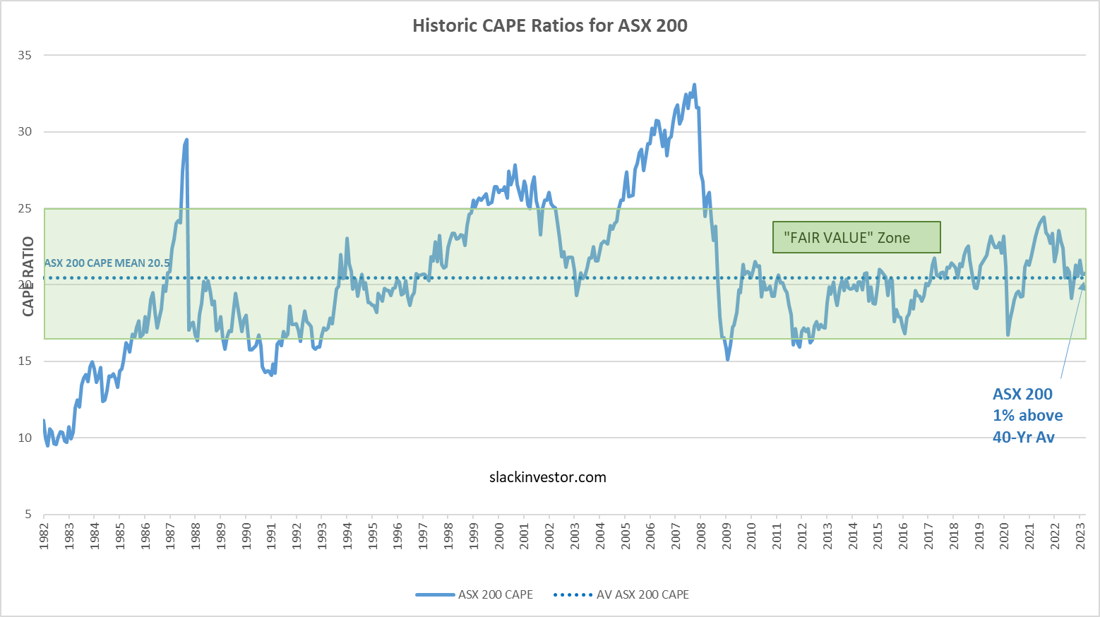
Using monthly CAPE data from Barclays, the 40-yr mean is calculated and plotted together with the CAPE values. A “fair value” zone is created in green where the CAPE is within one standard deviation of the mean (average).
ASX 200 Value
Historic CAPE ratios for the ASX 200 – From 1982 to end of January 2024 – Click the chart for better resolution.
FTSE 100 Value
Historic CAPE ratios for the FTSE 100 – From 1982 to end of January 2024– Click the chart for better resolution.
S&P 500 Value
Historic CAPE ratios for the S&P 500 – From 1982 to end of January 2024 – Click the chart for better resolution.
At the end of January 2023, the FTSE 100 (11% below the 40-yr average) is the only followed market “ON SALE”. I love a price reduction!
The ASX 100 (4% above the 40-yr average) is in the “Fair Value” zone. However, the S&P 500 still looks well overvalued at 32% above the 40-yr average – and has just moved above the “Fair Value” zone.
Slack Investor usually just assesses stock market returns at the end of the financial year. However, calendar year 2023 was some ride.
The 2023 ASX 200 Chart
For the 2023 calendar year, the ASX 200 Index started at 7020, and ended up at 7590 – a 12-mth increase of about 8% – but, on the way, it fell to a year low of 6751 – a temporary fall of 3.8%.
Of course, If you did not look at the charts daily, these fluctuations would mean nothing. If you ony looked at the Australian Index at yearly intervals, 2023 would probably bring some joy. As well as the overall 8% gain for the year, when you include dividends, the ASX 200 Index total return for calendar year 2023 was 12.2%. The ASX “All Ordinaries” Index (Tracking Australia’s largest 500 listed companies) had a total return of 13.0%.
Slack Investor will again emphasize the joy of investing and mostly doing nothing – and trying to focus on longer term returns. One of the best summary charts I have seen for a while that shows calendar year returns has just been updated and published by Ashley Owen. Ashley uses the “All Ordinaries” Index rather than the ASX 200 Index- as there is more historical data available for comparison.
Total ASX “All Ordinaries” calendar year returns – with the the last 5 years highlighted – From Ashley Owen – Owen Analytics – (Click to Enlarge)
The first thing that jumps out in this chart is the amount of “Green” positive years vs the “Red” negative years. In 78% of calendar years, ASX Index returns are positive. The overall average total return since 1900 for the Australian “All Ordinaries” Index is 11.7%.
Inflation has been the topic of the day lately and Owen has kindly provided his calendar year chart in terms of Real Returns for the All Ordinaries Index – The total return minus the inflation rate (Consumer Price Index (CPI)). A certain amount of cash is worth holding to for liquidity – so that you can avoid selling stocks in a market downturn. Although cash can iron out some of the stock market fluctuations, being invested in cash is not a protection from inflation.
Total ASX “All Ordinaries” calendar year “Real” (minus inflation) returns – with the the last 5 years highlighted – From Ashley Owen – Owen Analytics – (Click to Enlarge)
Adjusted for cpi increases, the overall average “Real” total return since 1900 for the Australian “All Ordinaries” Index is 7.9%. Slack Investor is willing to put up with the volatility of share markets for an average “after inflation” return like this.
For financial independence and as a hedge against inflation, it is important to own growth assets – such as the Australian Share market. Sure, there will be the occasional negative annual returns ahead … but let’s not worry about this while the Australian stock market is rising. Long-term overall results are the important thing.
January 2024 – End of Month Update
Slack Investor is IN for Australian index shares, the US Index S&P 500 and the FTSE 100.
After a big Christmas Rally, things have settled down a bit with modest gains for the ASX 200 (+1.2%) and the S&P 500(+1.6%). The FTSE 100 had a small fall ( -1.3%)
It was time to adjust the stop loss for the S&P 500 as the current value is over 15% greater than the stop loss. Slack Investor has long believed the US market is overvalued and, while enjoying the journey, is happy to have his stop loss a little tighter. It is difficult to do the adjustment on the monthly chart, so I had a look at the weekly chart for the S&P 500 below. I am looking for a dip in the chart that represents a “Higher low”. The new stop loss now stands at 4682 – only 3% below the current value.


