

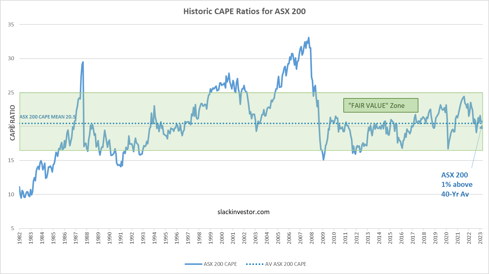
A few times a year, Slack Investor likes to take a snapshot of the markets using the Cyclically Adjusted Price to Earnings ratios (CAPE) which use ten-year average inflation-adjusted earnings. I first started using CAPE as a “value” tool in September 2021, and my most recent look was in May 2023.
By plotting this CAPE over a period of time, we can look at how the whole sharemarket is currently valued in terms of historical data – this way we can track the whole share market as it oscillates between overvalued and undervalued.
Using monthly CAPE data from Barclays, the 40-yr mean is calculated and plotted together with the CAPE values. A “fair value” zone is created in green where the CAPE is within one standard deviation of the mean (average).
ASX 200 Value

FTSE 100 Value

S&P 500 Value

At the end of October 2023, both the ASX 100 (8% below the 40-yr average) and the FTSE 100 (15% below the 40-yr average) are “ON SALE”. If I have a choice, I will always look to buy in the sale period.
The S&P 500 still looks a little overvalued at 16% above the 40-yr average – but at least it has slipped back into the “Fair Value” zone.
Discover more from Slack Investor
Subscribe to get the latest posts sent to your email.