

Slack Investor is often “banging on” about Price to Earnings (PE) ratios. The economist Robert Shiller designed the even sexier Cyclically Adjusted Price to Earnings ratios (CAPE) which use ten-year average inflation-adjusted earnings to take out some of some of the volatility of annual earnings. The details on how to calculate the Shiller CAPE Ratio can be extracted from Seeking Alpha.
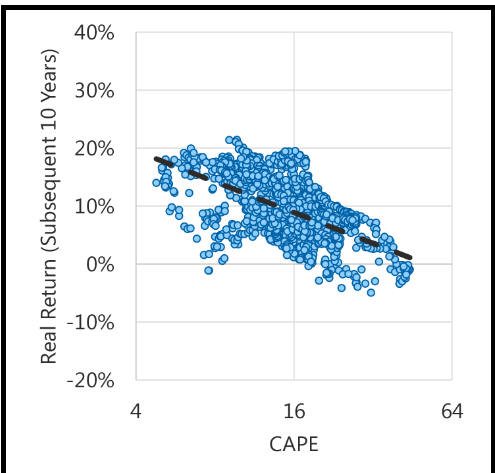
Professors Shiller and Campbell found that, the higher the CAPE, the lower the likely annual return from equities over the following 5-20 years. The current US CAPE is at one of its highest levels since the 1880’s. GuruFocus provide current information on the S&P 500 CAPE and market return predictions based on Shiller’s work.
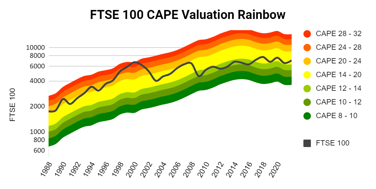
What originally started me thinking of CAPE is this excellent visualization prepared by John Kingham of Seeking Alpha for the UK FTSE 100. This chart shows how the current FTSE rates with fair value at a glance. John uses a “Fair Value” UK CAPE of 16 -just a bit below its recent average of 17.5. The UK CAPE black line seems still in “fair value” territory – according to Shiller, this is generally OK for a buyer in terms of long-term returns.
There have been a few criticisms of the use of CAPE as a predictor, as it has consistently underforecast returns for the past 25 years. Since the original research, new accountancy rules have brought significant changes to the way that company earnings are calculated. There are also arguments that CAPE values are structurally much higher now as the result of cheap money from the 40-yr decline in bond yields.

We are also in times of high government stimulus and, with interest rates so low, there is more than the usual amount of money in the share market. It is a case of no other alternative – perhaps, with the exception of residential property.
Slack Investor has no idea whether the extremely high US S&P 500 CAPE values may continue for a while … It is a complicated market at the moment. With the US Market at 38 times the 10-year average earnings … the US Market Is Not Cheap and, I am glad that my stop losses for index funds are set tightly within 10% of recent highs in the share price.
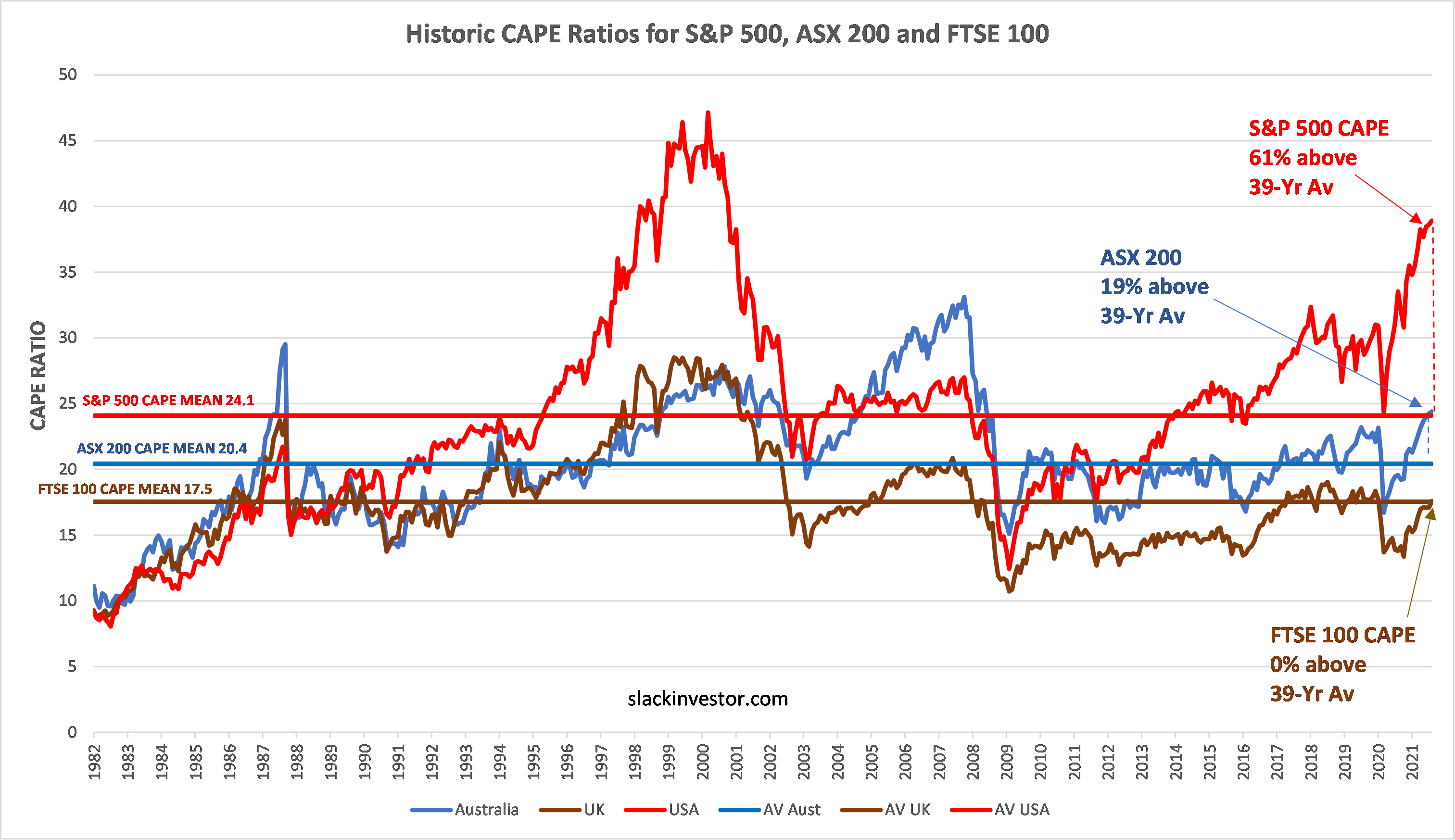
The rich data on CAPE ratios for a range of countries is prepared lovingly by Barclays each month. The CAPE values of the US S&P 500 CAPE, ASX 200 CAPE and the FTSE CAPE are respectively, 61%, 19% and 0% above their 39-yr averages. Interestingly, the US market CAPE (24.5) has a far higher mean than Australia (20.4) or the UK (17.5). This may be due to higher earnings growth prospects in the US.
Is CAPE a good predictor of a market correction/crash
In the below chart I mapped the US S&P 500 against the S&P 500 CAPE to see if the CAPE is useful for determining market turning points.
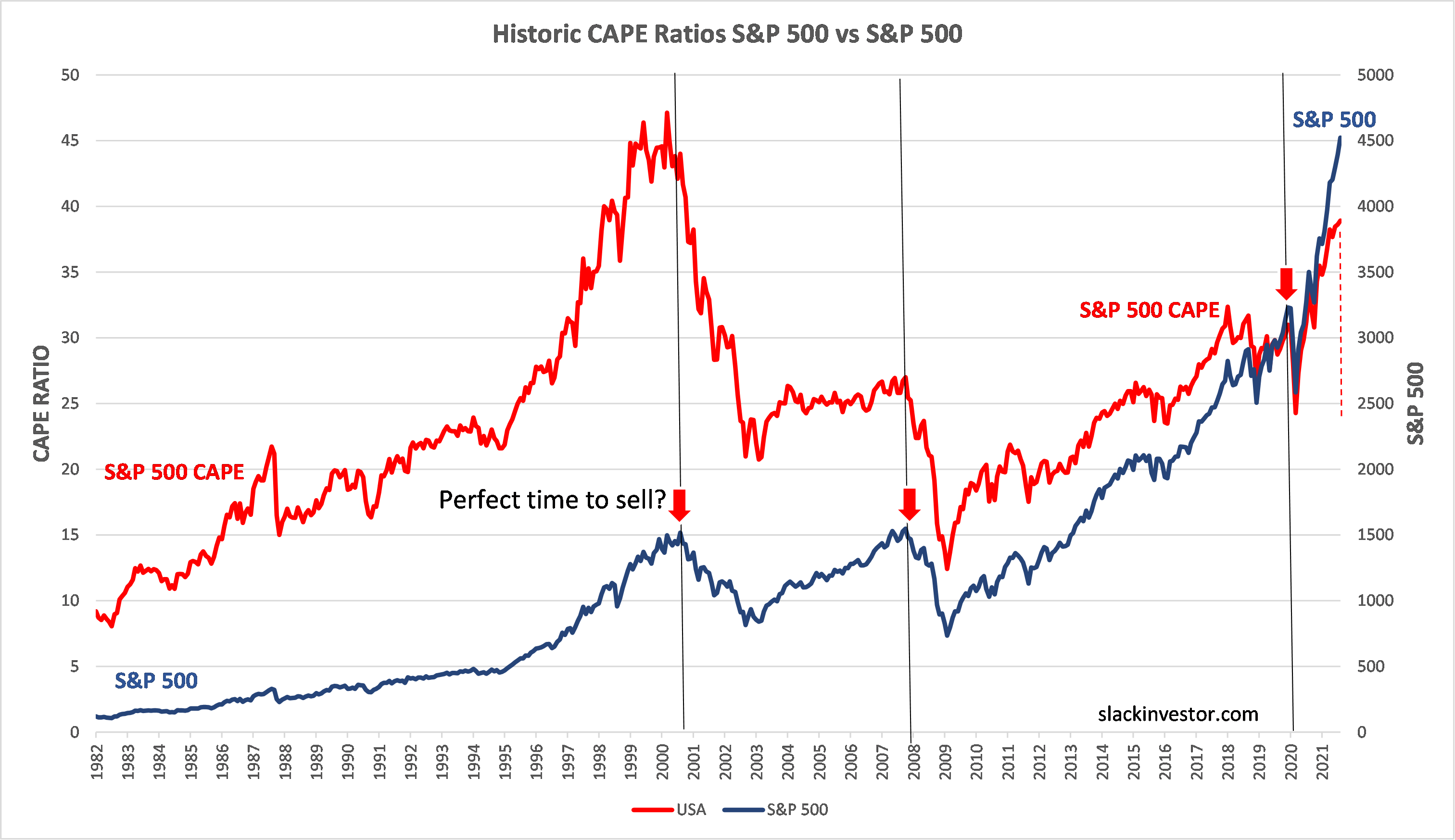
The CAPE indicator does not seem to be a good predictor of short-term share market prices – as high CAPE values have been at sustained high levels for many years. CAPE trends seem to immediately mirror the trends in the share price. However, Professor Shiller’s established relationship with high CAPEs and lower forward returns in the longer term is hard to ignore. Interest rates will not stay low forever. Regardless of the unusual circumstances of todays stock market, the US market at 61% above its 39-yr average, looks expensive.
September 2021 – End of Month Update

Slack Investor remains IN for Australian index shares (ASX 200), the US Index (S&P 500) and the UK Index (FTSE 100).
After 11 months in a row of monthly stock rises for the ASX 200, things are starting to get a little jittery in the stock markets. This is just normal behaviour. Decent monthly falls for the ASX 200 (-2.7%) and S&P 500 (-4.8%), the FTSE 100 flat at -0.2%.
All Index pages and charts have been updated to reflect the monthly changes – ASX Index, UK Index, US Index. The quarterly updates to the Slack Portfolio have also been recalculated.